About The Challenge
Every so often the Lindsay Marsh; the creator of the first Graphic Design course that I took in December 2019, “The Complete Graphic Design Theory for Beginners Course”, runs a design challenge for the students via its Facebook group.
Generally I try to participate in these challenge as many of them pertain to graphic design techniques/media that I generally would not indulge in myself – I do graphic art as part of my Data Art and Graphic Art portfolios.
Initially, I didn’t feel like participating in this challenge. It was only after I did the concept development and creation of the Samurai Sisters T-shirt design that I decided to submit an entry inspired from the T-shirt!
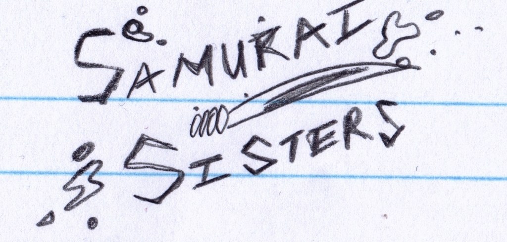
A Simple Pencil Sketch
The challenge guidelines were as follows:
- You could redo a poster from a previous movie. Alternatively as a bonus you can make up one yourself – I obviously went for the second option.
- The poster has to include a main title, focal point and the main actors names. Another bonus is to add extra credits such as the composer, the director, the producer, etc. – I tried to incorporate as much that wouldn’t clutter the final image
The challenge workflow was as follows:
- Choose a movie genre – Here mine would be a urban sci-fi action. I did not disclose this upfront as I wanted the poster to portray that automatically.
- Create a plan or concept layout – I did this, but forgot to submit it along with the challenge LOL!
- Create and showcase the final movie poster – I completed the poster over a little more than a week and then amused myself with a movie merchandise advert too!
Design Process
Here is my movie poster layout, which I forgot to submit… but there were so many submission that I don’t think it mattered much.
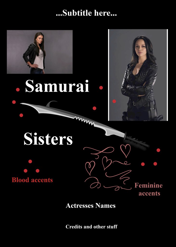
So my thoughts here were to have the main typographic elements (i.e. the title text) be separated from each other by the samurai sword. In the original concept design for the t-shirt, you would notice that I did add the traditional samurai sword initially. But after some browsing on the internet I settled for the more ‘modern’ one to fit in with the modern Asian typography.
Afterwards I added the blood splatters to give it more action and movement.
Then I wanted to add a feminine accent as the original T-shirt slogan was meant as a women empowerment design with an updated more kick-ass look rather than just some hippy typography with the words “Girl Power”. I wanted to do something more original that is feminine but fierce!
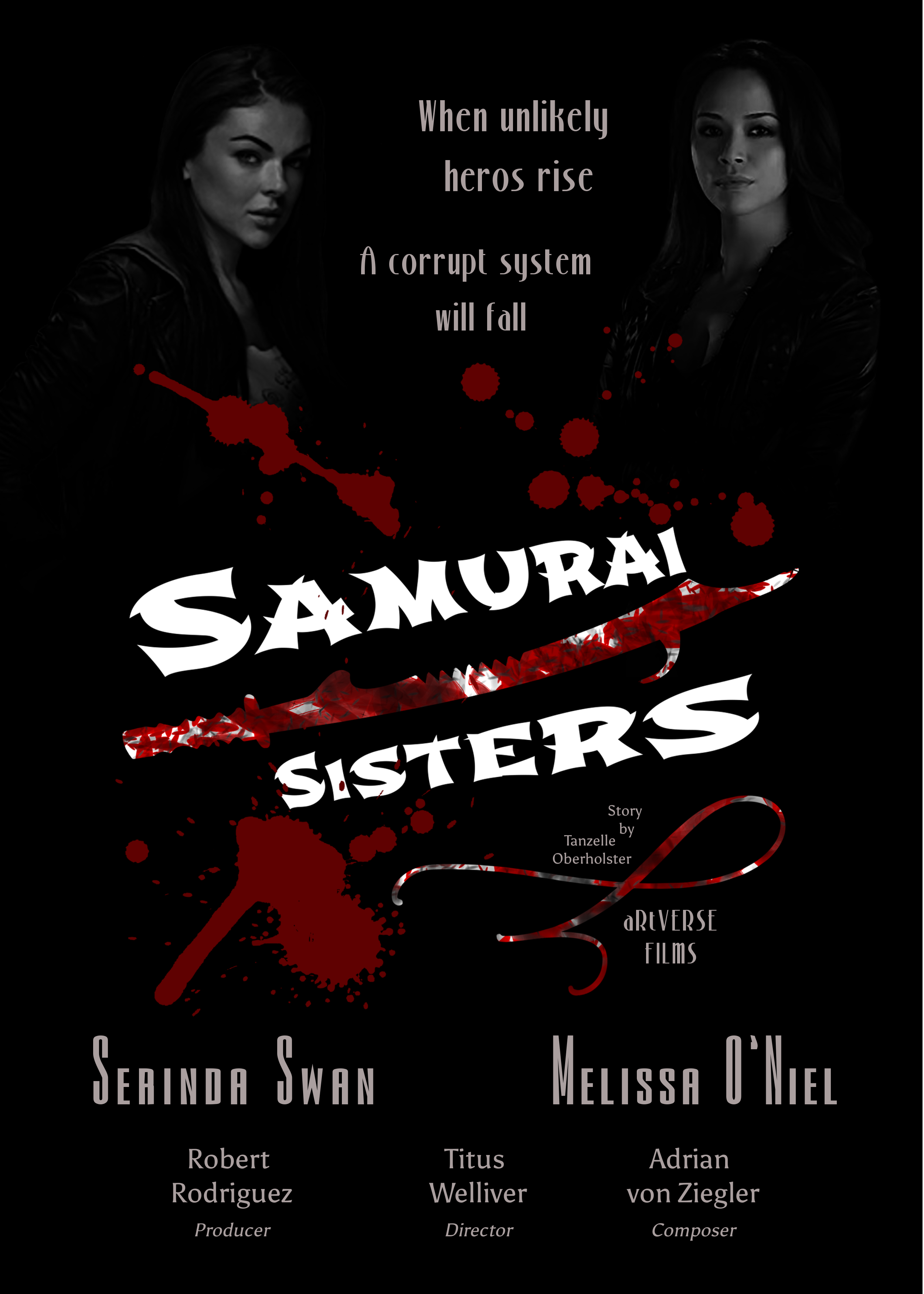
With the main focal point and title inherited from the T-shirt design I added the photographs of Serinda Swan and Melissa O’Niel – they are both Canadian actresses who have done powerful female roles. I wanted to keep with the strong female aspect of the original design. It took me forever to find the photos, I wanted photos with attitude and most were model/high fashion photos. I found these and then fixed them up a bit and converted them to greyscale. Each actress then got a position on either side of the poster.
I added the subtitle between the two actresses and then moved on to the bottom credit section with a few hours of adjusting things a pixel this way, that way. 😁
Considering that this is a modern urban sci-fi action, I decided to look for people to support ‘My Vision’ – such that Robert Rodriguez was the producer of Alita Battle Angel, Titus Welliver was the director of Bosch and Adrian von Ziegler who makes awesome sci-fi music!
Final Result
All of that lead to the final poster:
I would also mentioned that the main movie design is available on my Teepublic store! Yes, you can literally support my fake movie by buying its merchandise on T-shirts, Stickers, Totes and more! Go Check It Out!

https://www.teepublic.com/t-shirt/8363035-samurai-sisters-movie-splatter-blood-sword-white?store_id=251610
Challenge Conclusion
I was glad to have participated in the challenge after all as it was great fun once I had an initial muse. I also got great feedback from Lindsay Marsh during the review process! She was impressed that I was able to create all of the elements using GIMP (a free photo manipulation and digital art program).
“Love the title, splashing and I love the sword here… The Samurai Sister icon is excellent work with the typography, headline and title… Overall really really good”
Lindsay Marsh
I got some suggestions to add profile pictures for more connection to the story and emotional connection to the actresses faces. But as she mentioned during the review I did not have access to the photos I would have wanted and I made do with what I had. I wanted attitude and stank-face! 🤨
Another suggestion was the centre alignment of the subtitle between the two actresses – I purposefully did not go with the centre alignment here as the poses of the actresses are very different and the centre alignment would make the text too close to Serinda and far away from Melissa – which results in a lop-sided look. So here I am going to stick to my artistic choice! LOL! 🤗
It is interesting to see how one little 5 cm pencil sketch can grow into a T-shirt design and Movie Poster!
Great fun indeed and I am looking forward to the next challenge!
© Dr Tanzelle Oberholster
References
- GIMP – Free GNU Image Manipulation Program
- Canva – Design Anything – Referral link, join for free and starts designing to earn up to 20 credits for premium images!
- Udemy – Referral links used in the post!
See More At My aRtVerse Store!

aRtVerse @ Teepublic
ART SCIENCE NATURE
Want to start up your own store? Sign up here as a Teepublic Designer!
